Digital Documentation: Can we capture reality?

Just as written works are looked at for facts and information, media works are also used to inspect a specific moment in time. With that in mind, documentary photography can be considered an interpretation of reality. However, as any form of visual art, photography involves the representation of moment through the stylistic choices and decisions made by the photographer. With the perspectives of photography as an art form and a form of interpreting reality, can we really consider photographs as factual documents?

The concept of photo documentation began shortly after photographs became prevalent in America. Unlike photography today, images were harder to print and distribute as a mass production. Photographers had to use print methods such as lithography and engraving in order to produce images in a less expensive way. As photography became more popular, the idea of using the images as a form of documentation developed.

So what is considered a documentation? To begin with, the photographers who were initially considered as photo documenters had specific characteristics in their work. As James Curtis explains, “Documentary photographers were mere recorders, skilled technicians to be sure, but passive observers of the social scene and definitely not artists” (Curtis 2). The photographers that succeeded the most, including figures such as Dorothea Lange, worked to fulfill the desires of their audiences by communicating societal views in their images. Photographers did this by finding and creating public scenes that expressed their views in order to capture and distribute images.

Screen Shot 2015-11-08 at 2.35.06 PM

Lewis Hine, One Arm and Four Children, 1910

The above image, documented by Lewis Hine, depicts the issue of families who were “victimized” as a result of one parent being injured in an industrial accident. Hine wanted to highlight an issue that he viewed as a major concern at the time. This image exemplifies the idea of a photographer imposing his or her views into a documented photo.

The debate over whether photography can be considered documentation of reality is heightened by the photographer’s views that are present within each photo. It is difficult to determine whether an image is factual or not because the purpose of an image is subject to each photographer and each photo. An image can be used for political activism, to encourage the public to donate or support a particular organization, or to be sold for the means of actual profit. The intention of an image, including the evidence it yields, is an important to consider when determining the truthfulness of a photo that claims to document reality. Photographer Sean Sprague believes that photographers can, in a sense, provide a more accurate documentation of a moment through photography. Sprague believes that, “By spending several hours shooting a scene and merging elements from each into a single frame, I can create, in some way, a truer depiction of that space because I’m not capturing an outlier moment” (Roch 1). As Sprague argues, it is the mindset of the photographer that determines how a scene will be portrayed and for what purpose it is being documented for.

It is not clear whether documentary photography can be considered real or not. Based on the idea that different photographers have different intentions for their photos, it is hard to categorize all documentary photographs as either real or fake. However, there is certainly an element of all photography that deals with interpretation of a moment in a way that documents it.

The City: Works from the Collection

DSC01168 copy DSC01166 copyDSC01174DSC01181 copy DSC01170 copy DSC01188DSC01164 copyDSC01196 copy

Thursday October 15,2015

Interview with Andrea Inselmann: Students’ Transformation to Amateur Curators

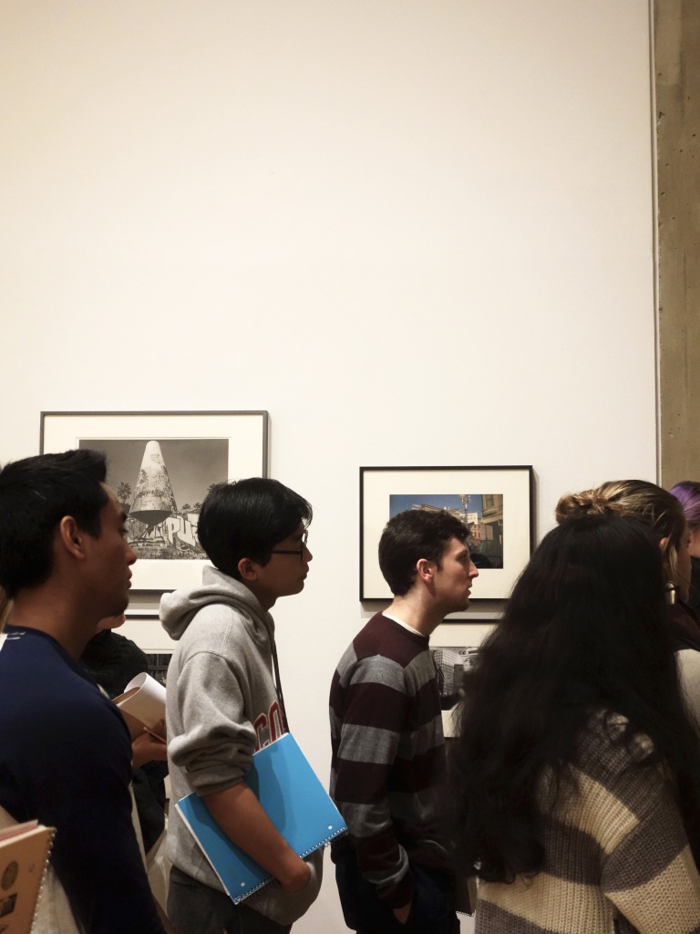
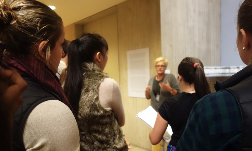
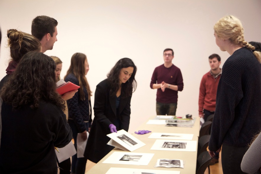
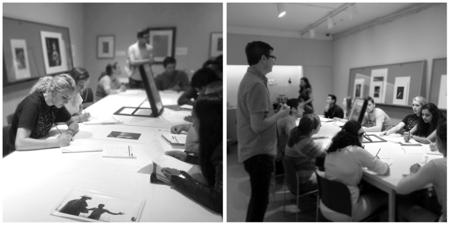
Seventeen Cornell students ventured to the far corner of the Arts Quad, through Ithaca’s rain, excited and ready to learn from a professional curator in an effort to enhance their career as amateur curators. On October 15, 2015 our Intersubjective Bodies of Photography class met at the Johnson Museum for an interview with Andrea Inselmann, Curator of Moden and Contemporary Art and Photography at the Johnson, who worked with Sonja Gandert, curatorial assistant at the Johnson, to created the exhibit “The City: Works from the Collection”. Through the interview Inselman explained the process of curating exhibits, with reference to this specific exhibit, and provided the class with advice for selecting images and composing our own exhibit. The beginning of the class period was dedicated to listening to Inselmann’s stories of the process of making “The City: Works from the Collection” and in the end we had the opportunity to ask questions.

An important aspect of the City Exhibit, according to Inselmann, is the organization of the images. On one wall the photographs displayed were all taken of the West Coast, and many of the images depict car traffic, which represents the open feel of the West Coast. Whereas on the opposite wall, the photographs selected were all taken in New York City and they depict the foot traffic and crowed feel of Manhattan. We also learned that in the exhibit images are grouped in smaller numbers by their photographer or aesthetic elements.

Wall of Images of the West Coast
Wall of Images of the West Coast with a focus on the space between images, October 15, 2015, “The City: Works from the Collection”

When asked about the spacing of images, Inselmann commented on how they grouped the images for her show. She was away during the physical set up of the show, and as a result the spacing between images is not as she had envisioned. The three images in the middle of the set of four images, on the right, and the set of two images, on the left, are easy to find because they have such a large spacing that separates them from the other groups of images. These photographs were all taken by the same photographer, hence why they are grouped. However, because Inselmann was not present during the physical set up of the show, she was not able to space the images, and as a result the space between the grouping of the photographs is, according to Inselman, too large.

Not only did Inselmann teach the class about the curating process, she also gave us advice. Inselman advised the class to think of the curating process as similar to writing. When curators being they select many images as their draft. Then they being to categorize these images, and they start to edit down the number of photographs or pieces of art in the show. This process, similar to the editing process, continues until the show is finally curated, or published. Inselmann also advised that in the editing process the curators cannot be too attached to the images. Already students have become attached to images, so it will be interesting to see whether people become more open as we continue to curate our show. When asked about working with others to create an exhibit, Inslemann said that co-curating is difficult and it is something that she never wants to do again in her career.

Continuing on, it will be interesting to see how much of the advice from Inselman will by applied, and how our class can learn from some of the reflections that she offered from her show. Though we have completed the selection process, many tips from the interview are still applicable to our exhibit. We are lucky and grateful to have had the opportunity to meet with a professional curator, and hopefully this will help our class organize a cohesive and refined exhibit in the upcoming month.

Using the Photographic Eye

Seeing photographically can transform the way that we view the world around us. With a camera in hand, everything and everyone is a potential subject. As students of Intersubjective Bodies of Photography, we have been looking at photographs, reading about photographs, and writing about photographs. But for this assignment, we would become the photographers. Smartphones or digital cameras in hand, we set off on a mission to take photographs. Most of us stuck to Cornell’s campus, a beautiful place with plenty of subject material. The difference between us students and other people snapping photographs of fall foliage or one of Cornell’s famous gorges was the way we approached taking the photographs. After having read and discussed photographic sight, and viewed photographs taken by those who demonstrated it, we looked differently.

Light and shadow, contrast, reflections, and interesting angles caught my eye because of the way I was looking at the world. As a class, we had been informed by our readings about photographic sight. As it appears in The Photography Reader, Ossip Brik states that, “The task of the cinema and of the camera is not to imitate the human eye, but to see and record what the human eye normally does not see” (90). Brik claims that looking at the world with human eyes and looking at the world through a camera are two different things. Walking around Cornell looking out of the eyes of a student and the eyes of the camera are different. The student is focused on upcoming classes and prelims, thinking about friends, food, and a million other things. The student may keep their head down, hurrying to their next class, ignoring interesting details that they pass everyday on the same trek across campus. The photographer, however, is slower, and notices more. I looked for images that were unique, taken at just the right moment, and from unusual angles. These three topics were covered as part of photographic sight in the reading that our class did.

John Szarkowski wrote that, “The central act of photography, the act of choosing and eliminating, forces a concentration on the picture edge- the line that separates in from out- and on the shapes that are created by it” (The Photography Reader, 100). Part of photographic sight is choosing an image that is interesting within the frame and extent of the photograph. Our class spent a lot of time discussing how a photograph freezes a portion of time- an instant tiny part of a much larger scene. That scene may be an accurate representation of the larger scene, or it may not be. It is up to the photographer. They can cut whatever they want, perhaps portraying a message that contrasts with reality. When using a photographer’s eye, I paid attention to what I wanted that cropped instant to be. I knew how important it was to take the picture at the right time, and to include everything that I wanted within the frame.

In addition to when the photograph was taken and what was included in it, our class also discussed a photograph’s uniqueness. In the digital age, when so many people have access to cameras that go everywhere with them, scenes are photographed millions of times. When a visitor comes to Cornell, they will likely take a photograph of the clock tower. It is clearly a wonderful aspect of Cornell, but the image is so common to students that they probably are no longer struck by it. So, when looking through the lens of a camera, I did not look for images that were conventional, but rather images that were interesting, and perhaps had never been photographed before.

After taking the images, we had to write about them, analyzing the use of photographic sight in our own photographs. This was not too difficult, as we happened to know exactly what the photographer was thinking when they took the photographs. No guessing involved. I analyzed the use of various aspects of photographic sight in the images. Each image that I took employed a different kind of photographic sight. Figure 1 is both unique and captured at the perfect instant, cropped to exclude aspects of the scene that did not work in the image.

This assignment allowed our class to take a break from the textbook readings and essays and get into the field of photography itself. Overall, taking the photographs and having to employ photographic sight myself led me to gain a deeper understanding of the photographer’s eye. The way that I was looking at Cornell was completely transformed.

Untitled - Doubleday
Figure 1. “Untitled” by Author, 2015

Needle in a Haystack

There is a wide array of reasons why people choose to take a day trip to a museum. Perhaps they’ve just found out that Cornell University has an on-campus art museum, or they are rising artists desperate for inspiration from those who’ve made it, or perhaps they are engineering or architecture students struggling to find peace and quiet to relax their minds for even just a measly half hour.  Regardless, each exhibit is crafted and curated to provide what each visitor needs. So what was our exhibition going to provide?

We all were given the task of sifting through the Johnson Museum’s online database of digitalized works of art, Luna, to find two photographs that have potential. There is no perfect algorithm that allows us to select which images make the cut and which don’t. In fact, deciding on image inclusion is a subjective process that each student approached differently. Though we had nothing to do with the capturing of these photographs, and essentially knew nothing about them besides what we could see with our own two eyes, we are adopting these works. They were going to be scrutinized in front of our peers with our names on them one day and the thousands who walk through the museum the next.  They needed to be perfect.

Researching with Luna is not an innate skill; the site is composed of several links relating to collections as well as featured media and a search bar. Not having much of a direction, besides the fact that we needed two photos and they needed to relate to our class discussions, we hesitatingly typed a variation of “photograph” into the “advanced search” bar. Keeping our lofty classroom discussions on consent, truth as it’s represented by photographs, and relations between the photographer, viewer, and subject in the back our minds, we scrolled away.

Finally, our eyes landed on the one. It was everything we were looking for. It depicted people, stood out, and seemed to be just waiting to be analyzed. With anxious fingers we all clicked on the thumbnail of our own “needle in a haystack”, glanced to the tombstone on the left of the screen, and jotted down the accession number only for the process to be repeated.

Pat Benson’s Street Scene – Naples, while an exquisite photograph dense with content to discuss, was a mystery beyond the image. When attempting to do research using Luna and other sources that had been sufficient for my classmates, I found that this work was quite literally one-of-a-kind. Benson had been an amateur photographer living in Ithaca who donated this piece to the Johnson Museum in the late 1950s. So, while an intriguing story, I was forced to move on to find a photo that fit better with the collection.

To have the perfect image is one thing, but to be able to write well-crafted essays with it is another. Sometimes your image is a part of a famous photographer’s collection, and you’re lucky enough to have several sources providing ample background information. But sometimes, as in my case, the photograph that you thought would open several doors for you  was actually just a dead-end. It certainly was not a perfect process, and the difficulty of letting go of an image you have grown fond of was facilitated by the comfort in knowing this cut would help the exhibit as a whole.

All in all, deciding which images were good enough to be considered for this exhibit was a daunting task. How were we supposed to happen upon a photograph that encompassed all the pages of readings, minutes of class discussion, and days spent at the museum? Luck? Diligent searching? We wanted our images to reflect highly of us as intellectuals, as well as on our class, and professor as a whole. It was our reputation on the line as it was going to be our names on the exhibition, and that is why we could all take a sigh of relief knowing that although our selected works were to be dissected by the class the next day, at least the responsibility of coming together with an exhibit was a collective effort.
!!

A Day in the Life of David Brown, Museum Photographer

As part of our class, we were lucky enough to get the chance to talk with professional photographer for the Johnson Art Museum, David Brown. Before this meeting, our class had been talking a lot about the photographer’s perspective. This “perspective” we had discussed ranged from camera angles to the subject’s rights and truth. When we met with David, he showed us his studio and what his work mostly comprised of, and then sat down with us for a private interview.

The first thing we discussed was his view of what it means to have the perspective of a photographer. We talked about vantage point and the angles involved and how that leads to a sense of your subject. He told us from the view of the photographer, you can and should be able to tell if someone is uncomfortable with their picture being taken. But if someone is uncomfortable, is it still okay to take their picture?

David had a lot to say on the issue of consent – in terms of both taking and distributing the photos. He told us his personal philosophy when it comes to getting subject consent: David always makes sure to get permission from the subject if the person is recognizable in the frame (i.e. their whole face is showing and in focus, or there is another identifiable characteristic). He also told us that he believes as long as he gets the permission, it doesn’t matter if he got it before or after taking the photo. David told us he has dealt with this issue of consent before, and described two instances. The first was where he took a photo and his subject later asked him to delete it, which he did. The second time was when he was on an assignment and had previously gotten consent for taking photos of a crew, but when the assignment got personal and emotional, the leader asked David not to take his photo, because he was very moved, and David acquiesced. These are the kinds of decisions photographers must make all the time, a distinction David described as being “between legal and moral rights and permission.” In this instance, David, coming from the photographer’s perspective, respected his subject’s rights at the expense of a potentially great photo. Some photographers would not have made the same decision – something David describes as “photographers hav[ing] different levels of aggressiveness and comfort” – but David thinks respecting rights is worth it, even if it means losing a photo.

After this, we spent a long time discussing the perception of viewers. David described to us how the camera changes the way people view the world. He said that the camera simultaneously presents documentation abilities, and is never entirely accurate. He said that a photo should not be accepted as fact because it is always taken from someone’s unique perspective. This is something we have also talked about in class – the fact that a photographer inherently makes a photo biased in some regard. Most people think that a photo is factual and objective, but this is not the case. If 100 people were asked to take the same shot, there wouldn’t be any identical ones because of slight differences in angle and framing.

This subjectivity is true of all photos, which is why they can be misleading. We discussed with David how this can especially be true of the editing process. He answered the question of whether he thinks editing takes away from a photo by saying it is determined by the intended use and objective of the photo. If it were meant to be factual, then this editing could definitely take away from the photo, but if the goal were just to make the most beautiful image that you can, then he believes that is very different.

The Object Label: A Link between Art and the Viewer

While integral to take into account scrutinizing and analyzing photographs with help from readings in class mixed with class discussion on what a photograph, or piece of art, can be interpreted as in order to extrapolate a further reading into photography, it’s also vital to understand that not everyone is in an intersubjective photography class. With this, we need to understand that the people entering and leaving the museum either aren’t necessarily trained scholars in the arts, or simply don’t have the time to read into every single piece of art in order to fully appreciate its value, or the artist’s intention and background. Thus we learned about the object label and how to effectively write one. An object label is accompanying text with a photo, or piece of art, that sufficiently details the viewer what the piece of art is about, and its background for being created. Museums contain the art which we analyze, specifically in our case, the Herbert Johnson Museum of Art. With advice and prior knowledge, we were assigned with writing object labels for a specific piece of art.

What is challenging about the simple object label is the precision and conciseness that leads to an effective label. Balancing background knowledge and analysis of the piece at hand is important yet can be difficult. We used examples in class of certain pieces from the museum with their respective object labels in order to get a sense of what was the right balance, how to structure the label, what works and what does not. Analysis of the object is important, but it’s also important to keep the reader in mind, not everyone is a scholar with the piece at hand and might not have any insight of what the piece is. With that, it was found that writing an object label required sufficient background knowledge in the piece itself along with a just and valid analysis. Balancing these two is difficult, as describing a piece of art literally along with an analytical understanding, in only 100-150 words or less can end up in having essential facts and data being left out, but it’s up to the writer (us) to be able to derive what’s important to add, and what’s worth being left out.

Later on in the class, we discussed the difference between the denoted image along with the connoted image, as defined by Roland Barthes in his essay “Rhetoric of the Image.” I find comparisons of that discussion and the pertinence it had on writing an object label. Defining the denoted image is to describe what is actually there, while the connoted image tells us what we naturally relate to when we see this image. I see that writing an object label is a brief description of these two ideas, taking what is physically seen and telling us what it is that it tells us analytically. It’s also very important to include the background knowledge of the person who made the piece and the reason for its creation, if known.

The assignment itself wasn’t overwhelmingly complex, yet challenge came from being concise to keeping a reader involved when walking by a museum exhibit. Taking into account the reader, the analytics of the piece, and the background knowledge, it’s difficult to take a piece of art and condense it to 100-150 words. This, I found, inevitably helped efficiency with writing, writing with a cap allows only the vital words to stay and the unessential knowledge to be left out. Using only the important evidence and information can be challenging when facing a word limit, thus the difficulty of the assignment. Museum curators must take all these factors into account when writing an effective object label. If an object label lacks in information or analysis, then the viewer can be stuck lost or confused when looking at a piece of art, regardless of the medium of art.


Chinese Character Scroll
Photo of a Chinese character scroll and its respective object label
Chinese Character Scroll OL
A close-up of the Chinese character scroll object label


Selfies, Selfies, Selfies: A Look at Ourselves

photographer selfies

Our first day of class, and most of us were still trying to figure out what “intersubjective bodies” meant, when we were given our first assignment. With such little knowledge of the topic, we were all pretty relieved to find out the topic was something most of us were fairly familiar with: selfies. It was the perfect introduction to a topic most of us knew nothing about, and we set off to write our first college essay.

When I sat down at my computer to write, the first challenge facing me was to define and analyze a genre of photography, the selfie. I didn’t know it at the time, but this would be a tool we would continue to use throughout the semester. At first the definition seemed simple, a selfie was just a picture you take of yourself (it even has the word “self” in there), but then we were asked to compare selfies to portraiture. Now we really had to think about what defined or differentiated the two genres, or if maybe they were in some ways the same. No doubt we all had different opinions, but just forming an opinion was preparing us for future discussions about genres in the future.

Now we needed some selfies of our own to analyze, and that was a little uncomfortable. I had some selfies I thought were good, but I had never had to defend why I thought that before, I just liked them. And what if people didn’t agree that they were good and all my life I had been a horrible selfie taker? I couldn’t face that truth. Unfortunately, choosing the good selfie proved to be the easy part. Seeing as I had never attempted to take a bad selfie before, that process was a little strange. I could just make an ugly face, but just writing “I look ugly” wouldn’t have made a compelling argument. More elements were necessary compose the perfect “bad” selfie, and in the end, it was achieved by standing in my closet. This part of the process made me thankful we were analyzing the photos, and not taking them

The next step to the assignment was analyzing photos, something most of us had no experience with, and was made slightly more uncomfortable by the fact that we were analyzing photos of ourselves. At least we were all familiar with the selfie, and had either taken them, or seen them scroll up on social media. Defining “good” and “bad” ones didn’t seem like it would be too difficult, until it was. On social media, a selfie scrolls by and you form an opinion in a matter of seconds, and then scroll on to the next. In this assignment however, after choosing our good and bad selfies, we had to actually back up our opinions by referencing the photos and putting into words what was visually appealing or unappealing. Given it was our first attempt, our support might have been broad or unclear, but using photos as evidence was one of the biggest tools we would sharpen as the semester went on.

Even though at first this assignment seemed a bit silly, looking back on it now, it was the beginning to a long process of understanding how to write about photographs. We discussed genre, what made a photo good and bad, and even went behind the lens. By the end of the essay, I had a new appreciation for the course, and skills I would continue to use and understand.